
Role
Product Designer
Team
2 Designers
Timeline
5 Weeks
This project was completed as part of Concordia University’s User Experience Design Certificate, in response to a fictional Horizon Bank brief to design a standalone experience for new users.
As Horizon Bank expands nationally as a digital-only provider, attracting and retaining new users is a top priority. Because saving is hard to sustain, it presents a chance to deliver early value and build long-term engagement.
Many savings tools fail to keep users engaged over time. When progress feels invisible, saving feels unrewarding, and tools can’t adapt to real life, momentum fades and goals are abandoned. This leads to drop-off and fewer chances to retain users.
Horizon Bank, a Canadian neobank, aimed to attract new users through a simple, standalone product that solved a real financial challenge. The experience had to deliver value on its own, support onboarding for non-customers, and remain flexible enough to later integrate into the full platform.
Of the client-provided personas, Monique surfaced the clearest user pain. As a working parent with limited time and irregular income, her journey exposed real-world barriers to saving and offered a focused foundation for product direction.
Solution
Solution
Make Progress Visible


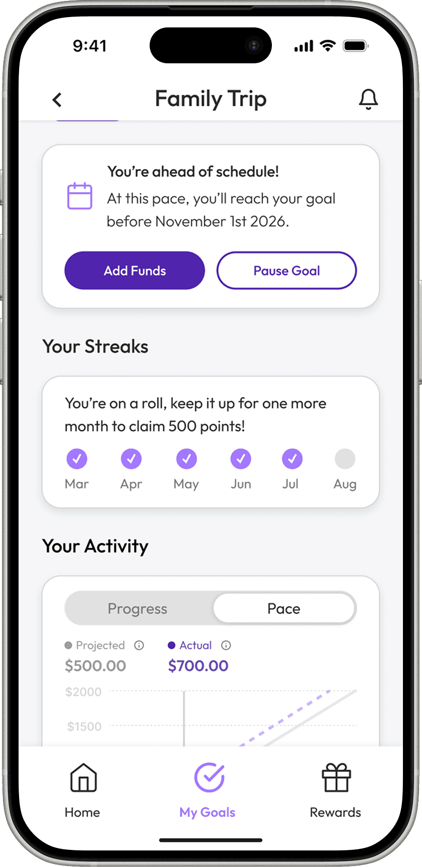
Projected Pace View: Shows if users are ahead, behind, or on track by comparing their saving pace to the target timeline.
Recent Progress Feed: Breaks down deposits over time to highlight consistency and uncover saving patterns.
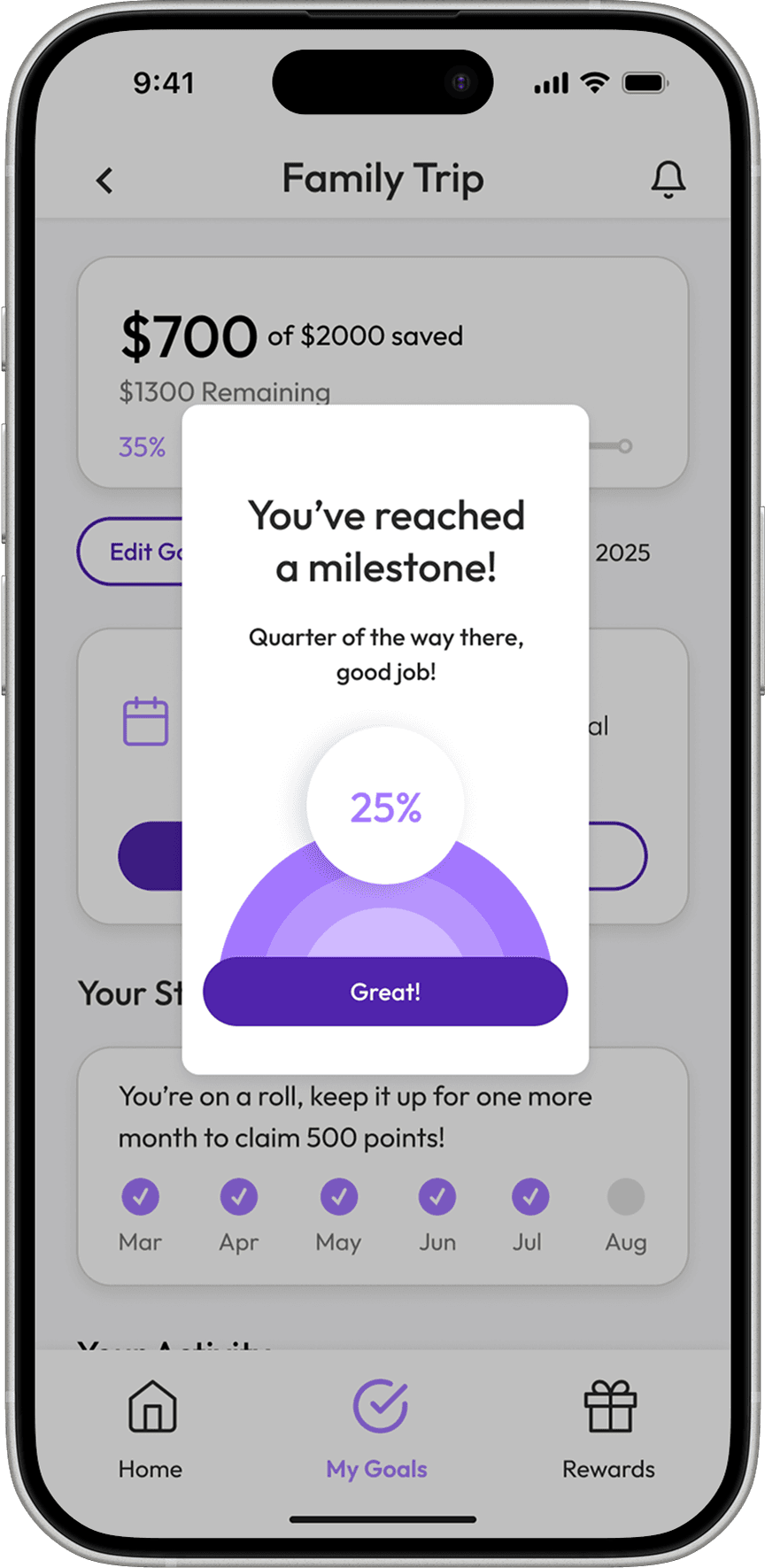
Goal Milestone Tracker: Divides long-term goals into smaller wins so users can see tangible progress early on.
Solution
Help Sustain Motivation


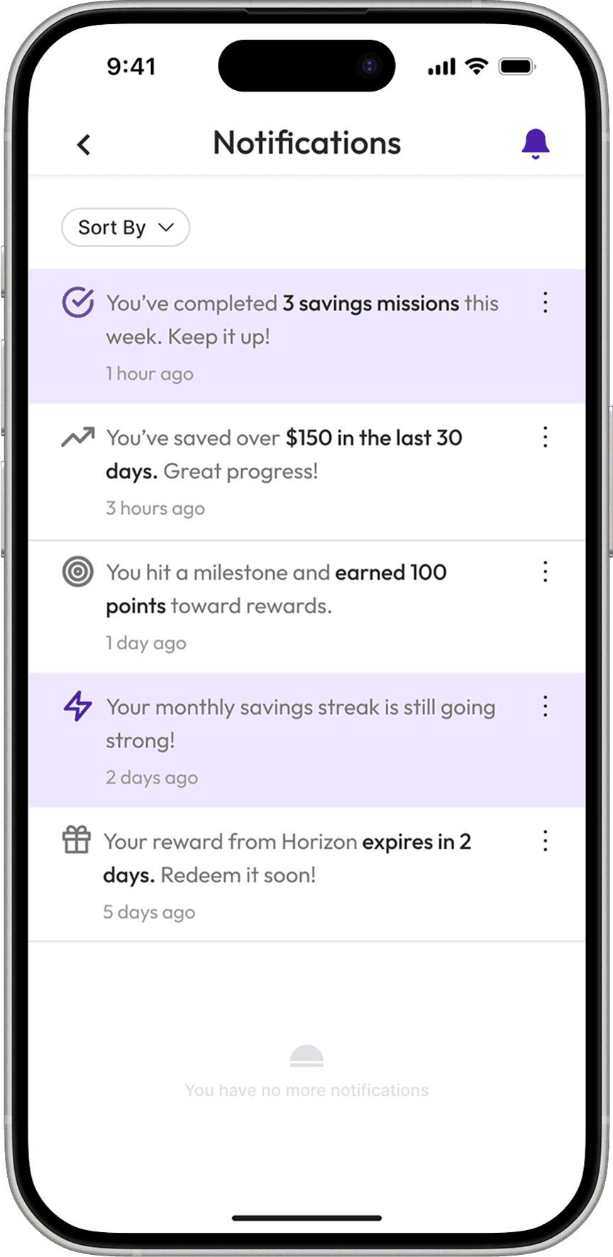
Points and Rewards: Incentivizes saving habits with redeemable points for missions, milestones, and streaks.
Mission Prompts: Offers bite-sized challenges between deposits to keep momentum going.
Streak Counter: Reinforces habit-building by tracking and rewarding consistent saving activity over time.
Solution
Provide Steady Support
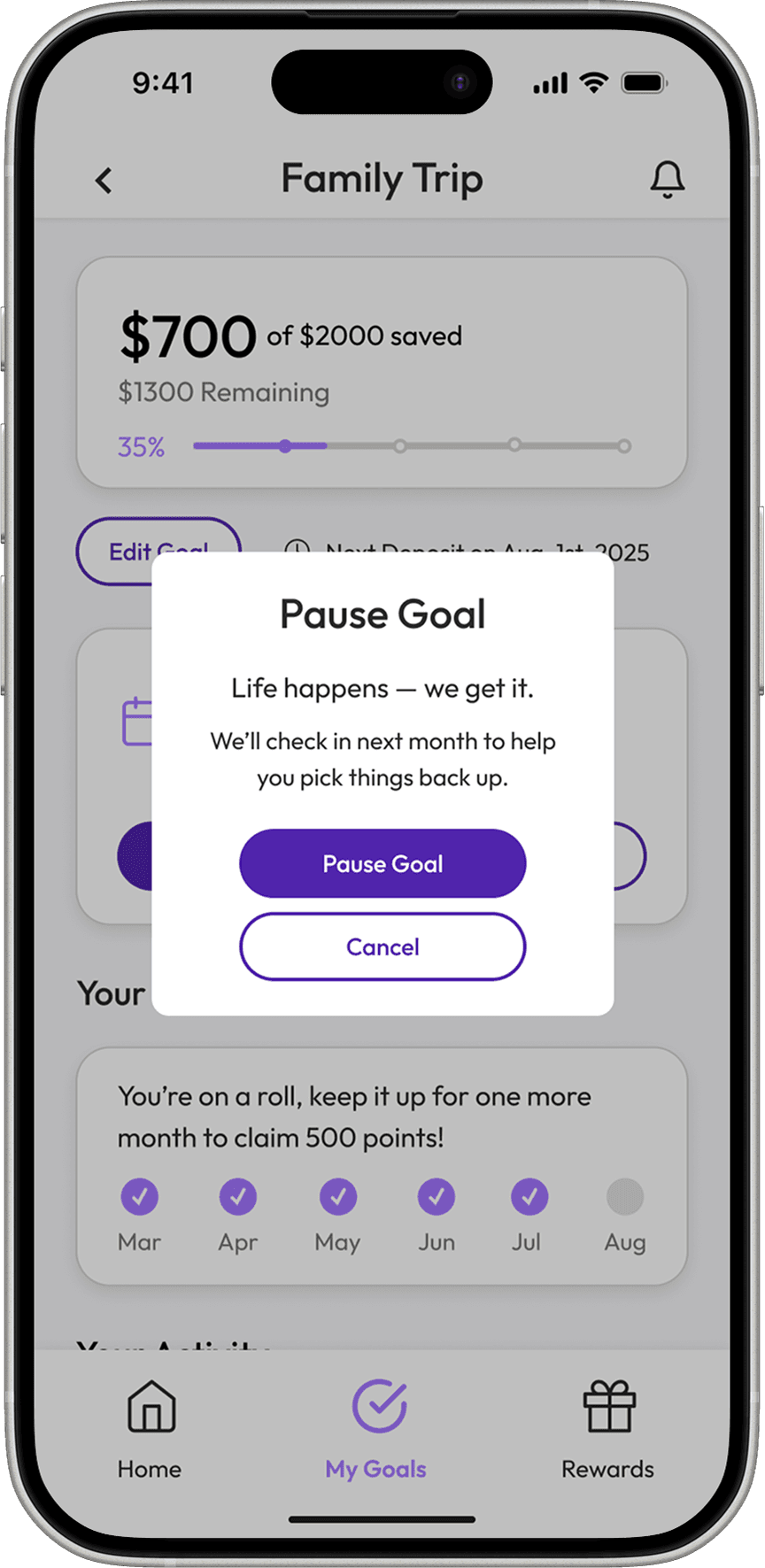
Flexible Goal Settings: Lets users adjust targets and timelines when plans change to avoid abandoning progress.
Supportive Microcopy: Uses warm, affirming language to keep users motivated without pressure.
Progress Nudges: Sends timely reminders tied to habits or milestones so users stay aligned without extra effort.
This solution was designed to help Horizon earn early user trust, support habit-building, and create a strong path to platform adoption. Each area below reflects a key behavior the product aims to shift.
Define
Persona
Monique is a freelance accountant and single mother of two. She juggles income streams on a tight budget and values financial control, but her time is limited and routines unpredictable. Rigid or unrewarding tools quickly fall out of use.

Key Insight:
• Monique’s experience revealed a core tension: even users with strong intent lose momentum when tools don’t adapt or show meaningful progress. This shaped a solution focused on flexibility, feedback, and emotional motivation.
Define
User Journey
Monique started with a clear goal and a basic savings account. But when life interrupted, there was no feedback or support to keep her engaged. Momentum faded, and she began looking for tools with more flexibility, visibility, and guidance.

Key Insight:
• Clear goals aren’t enough to sustain saving. When routines break and tools don’t respond, users lose motivation. Most products don’t support these in-between moments, creating a gap in long-term engagement.
Define
Problem and How Might We Statements
Monique’s struggle isn’t setting goals. It’s staying connected to them. When routines shift and progress disappears, saving loses urgency and drops off. Her experience revealed a gap: most tools don’t support the sustained effort saving requires.

Ideate
Competitor Analysis
To understand how saving is positioned in the market, tools from neobanks, budgeting apps, and major Canadian banks were reviewed. The focus was on how each supported long-term behavior through feedback, progress visibility, and guidance.

Key Insight:
• Most tools treat saving as a setup step, not a sustained behavior. Few offer support after goal creation, leaving users without reinforcement when motivation fades.
Ideate
Sketching
Early sketches explored how to keep users engaged by showing progress, reinforcing habits, and adapting to life changes. Concepts tested ways to make saving feel rewarding, even when motivation dipped or routines changed.

Prototype
Wireframes
Early concepts were developed into two distinct prototypes — one focused on structure and support, the other on motivation and momentum. Each explored how Horizon might help users stay engaged with saving over time.
Simple Support
• Reduces decision friction through friendly prompts and setup tips
• Builds confidence with simple, visible progress feedback
• Monthly check-ins offer space to adjust without losing direction
Playful Progress
• Encourages saving with small wins and ongoing rewards
• Light gamification helps revive stalled habits
• Continuous feedback keeps users engaged and moving forward
Strategic Direction:
• The client selected the gamified flow for its clearer differentiation and stronger potential to build trust, spark early engagement, and support long-term use. This aligned with Horizon’s goal to attract and retain new users.
Test
User Testing
After selecting the Playful Progress direction, usability testing focused on whether users understood the product, felt motivated by progress cues, and remained engaged even when habits were disrupted.
Study Goals:
• Do users understand the product’s value right away?
• Is onboarding clear and easy to complete?
• Is progress visible and motivating?
• Do users feel supported when routines break?
• Does gamification help sustain engagement over time?
Test
Test Findings
Usability testing evaluated whether the experience delivered clarity, motivation, and long-term engagement. Feedback revealed strong signals of user confidence, along with key areas of confusion and unmet expectations.
“I liked that I could make changes without feeling like I’d mess something up.”
“The app’s tone felt encouraging, like Horizon actually cares about my goals.”
“It felt calm and easy to move through. I never felt rushed or overwhelmed.”
“Oh, this is a bank? I honestly thought it was just a savings app at first.”
“The graph’s kind of basic; I was hoping for a clearer view of my progress.”
“The missions are fun, but I wasn’t totally sure what the point of them was.”
Test
Design Iterations
Usability testing revealed moments of confusion, hesitation, and missed opportunity. Focused refinements aimed to build early trust, clarify progress, and give users stronger reasons to stay engaged.

Clarifying App Purpose
• Some users didn’t realize the app was from a bank or understand its purpose.
• Added an onboarding carousel to introduce Horizon and explain its value.
• Improved early trust by making the identity and benefits immediately clear.
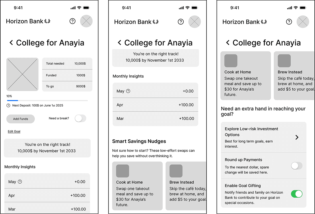
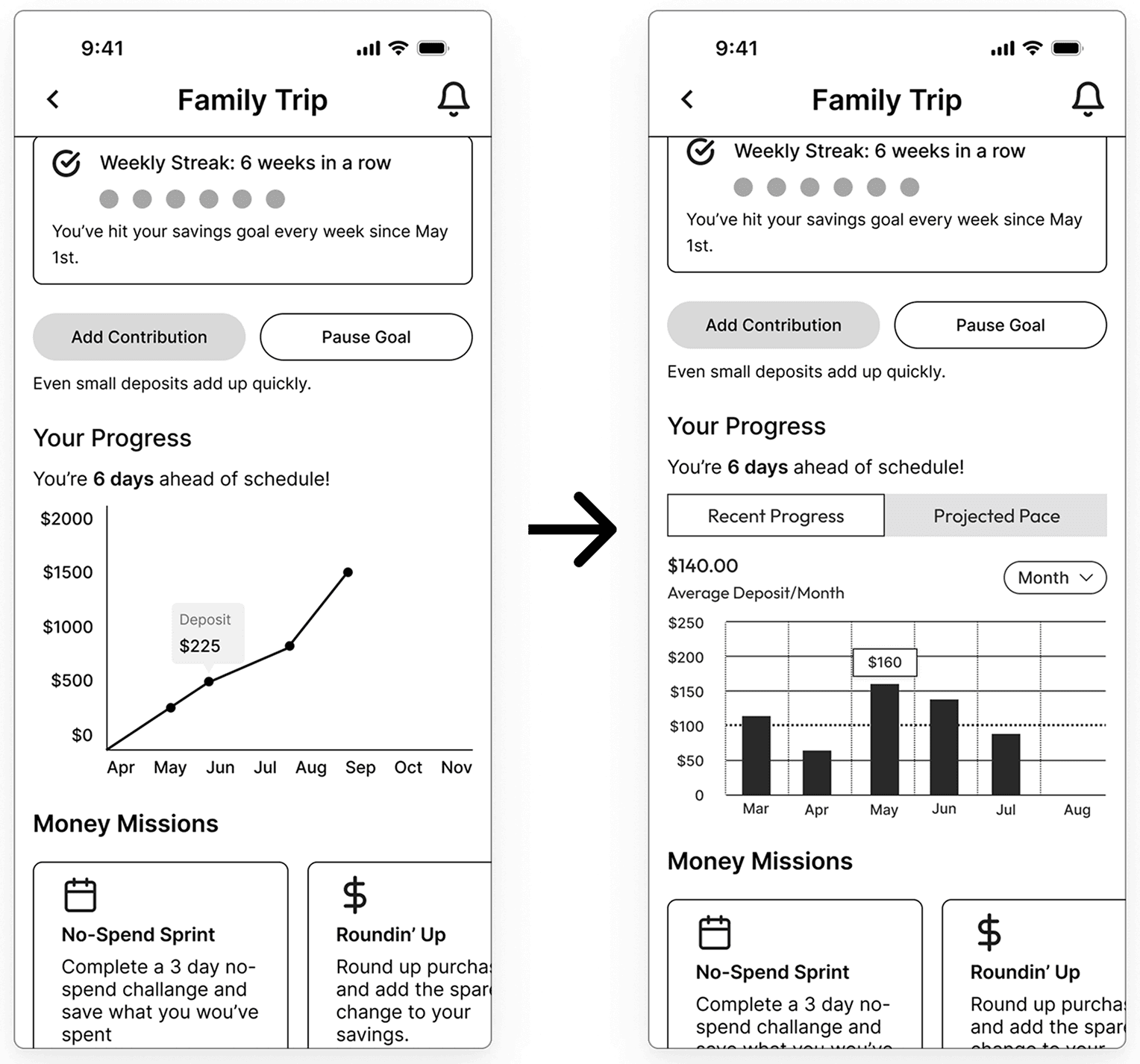
Breaking Down Progress
• Users struggled to understand how close they were to their goals.
• Split progress into two views: recent activity and projected pace.
• Helped users stay motivated by pairing habits with payoff.
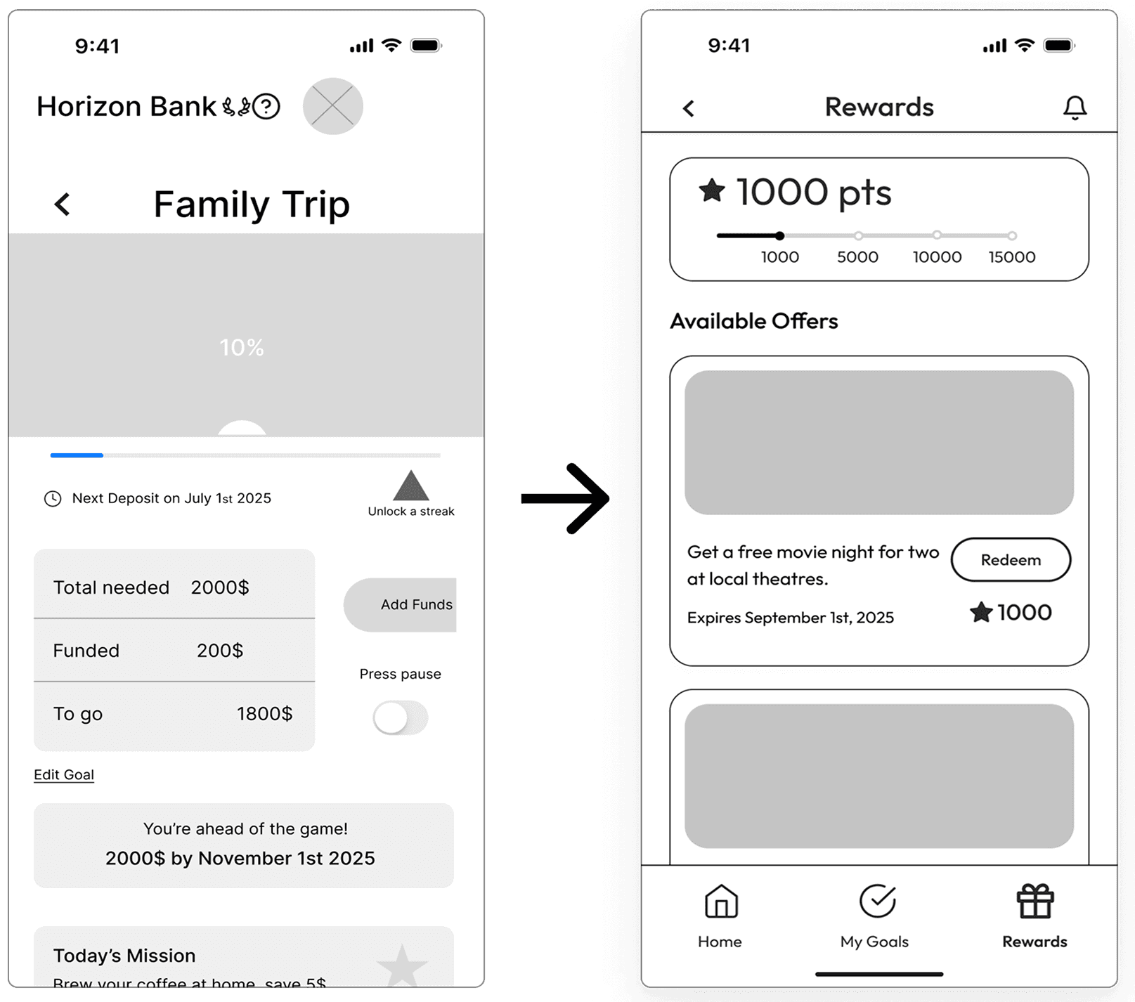
Strengthening Incentives
• Users liked the features but lacked a reason to return consistently.
• Introduced a points system tied to saving behaviors and small wins.
• Encouraged re-engagement by making progress feel rewarding and repeatable.
A style guide outlined color, typography, and spacing choices to support handoff. Specs ensured screen consistency and fit within Horizon’s design system, helping developers implement the UI accurately and efficiently.

Reflections
This project challenged assumptions about what sustained engagement really requires. These takeaways continue to shape how the experience could evolve with more time and iteration.

